Frameworks
What to put on a SaaS landing page before you have customers
You don't need 10,000 users, famous logos, or a wall of testimonials to launch a SaaS. Your landing page just needs to make the product understandable, credible, and easy to try. Here is how to build one when you are starting from zero.

Post by Anuj Shashimal
Founder, Founder.best14 min read
Here is a moment most founders know well. The product finally works. You open a blank page to write the website, and you freeze.
Every SaaS landing page example you have bookmarked has a row of famous logos, a dozen glowing testimonials, and "Trusted by 40,000 teams" in the hero. You have none of that. You have a product, a few beta users if you are lucky, and a waitlist of people you mostly know.
So you either stall for weeks, or you borrow copy that sounds impressive and says nothing.
There is a better way. You don't need 10,000 users, famous customers, or dozens of testimonials to launch a SaaS. Your landing page just needs to do three things:
- Make the product understandable in a few seconds
- Make it credible, using proof you actually have
- Make it easy to try, with one clear next step
This guide walks through exactly what to put on a SaaS landing page before launch, section by section, with copy formulas you can steal and a checklist at the end. It is written for founders launching before traction, not for companies with a brand team and a testimonial budget.
What your SaaS landing page needs before you have customers
Big SaaS companies use their homepage to reassure buyers who already know the category. Your page has a different job. Most visitors have never heard of you, and they are deciding in seconds whether this is worth their attention.
A pre-launch SaaS website needs to answer five questions, in roughly this order:
- What is this? In one sentence.
- Is it for me? Does it describe my problem?
- How does it work? Can I picture using it?
- Can I trust it? Is there a real person and a real product behind it?
- What do I do next? And what does it cost?
Every section below answers one of those questions. If a block on your page does not answer one of them, it is probably decoration.
| Visitor question | Section that answers it | What "good" looks like |
|---|---|---|
| What is this? | Hero and value proposition | One line: who it is for and what they get |
| Is it for me? | Problem section | Pain described in your customer's words |
| How does it work? | How it works, screenshots, demo | Three steps and the real product UI |
| Why should I care? | Benefits | Outcomes first, features second |
| Can I trust it? | Honest social proof and trust signals | A real founder, real users, real launch listings |
| What next? | Pricing, CTA, FAQ | One clear action with no surprises |
Put together, a pre-launch SaaS landing page usually ends up as eight stacked sections, from top to bottom:
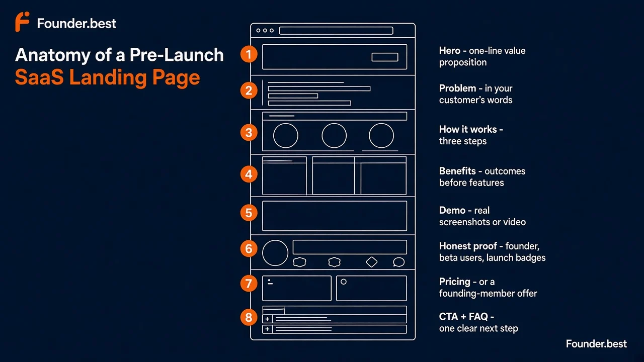 Anatomy of a pre-launch SaaS landing page - hero, problem, how it works, benefits, demo, honest proof, pricing, and CTA with FAQ
Start with a clear one-line value proposition
Your headline is the most important sentence on the page. Most visitors read it, glance at the screenshot, and decide whether to scroll. If they cannot tell what you do from the hero alone, the rest of your SaaS landing page copy barely matters.
The trap is being clever. "Work, reimagined." "The future of productivity." "Built for teams who dream bigger." These sound good in a pitch deck and mean nothing to a stranger.
Use this formula instead:
[Outcome they want] for [specific customer], without [the painful part].
A few examples:
- "Client reports for marketing agencies, without the Monday spreadsheet grind."
- "Uptime monitoring for indie hackers, set up in 60 seconds."
- "Invoicing for freelance designers who hate chasing payments."
Then add a subheadline of one or two sentences that explains how. For example: "Connect Google Analytics and Ads once. We build a branded client report every week and email it for you."
A quick test: show your hero to someone outside your industry for five seconds, then hide it. Ask them what the product does and who it is for. If they cannot answer both, rewrite it.
Tip: The best headline words usually come from customers, not from you. If you ran interviews while validating your SaaS idea, go back to your notes and look for the exact phrases people used to describe the pain.
Explain the problem you solve
Before visitors care about your solution, they need to feel understood. A short problem section does that. It tells the right visitor "this is for you" and quietly tells the wrong visitor to leave, which is also useful.
Keep it tight. Two or three short paragraphs or bullets are plenty:
- Name the situation. "Every Monday you export data from four tools into a spreadsheet."
- Name the cost. "That is 5 hours a week, and one wrong cell makes you look bad in front of a client."
- Name the failed workaround. "Templates break, freelancers are expensive, and the big BI tools are built for data teams."
Write it the way your customer would complain to a friend, not the way a consultant would describe a market. Specific beats dramatic. "You copy-paste the same numbers every week" lands harder than "Data fragmentation is costing businesses billions".
Show how your product works
People trust what they can picture. A "how it works" section turns your product from an abstract promise into something a visitor can imagine using this afternoon.
Three steps is the sweet spot:
- Connect. "Sign in with Google and connect your analytics account."
- Configure. "Pick a template and add your client's logo."
- Get the result. "Your report lands in the client's inbox every Monday at 9am."
Each step should be one short line, ideally with a small screenshot or icon. If you need seven steps to explain your product, either the product is too complex for a first version or you are describing setup instead of value.
This section also quietly handles an objection most founders forget: "Will this be a pain to set up?" If step one takes 60 seconds, say so.
Focus on benefits, not just features
Features describe what the product does. Benefits describe what changes for the customer. Early-stage pages tend to be all features, because the founder built them and is proud of them. Visitors, though, are asking "what's in it for me?"
A simple way to fix this is to write every feature as benefit first, feature second:
| Feature-first (weak) | Benefit-first (stronger) |
|---|---|
| Automated scheduling engine | Reports send themselves every Monday, so you never forget one |
| Multi-source data connectors | Pull Google Ads, Meta, and GA4 into one view with no exports |
| White-label templates | Every report looks like your agency made it, not a tool |
| Role-based permissions | Let your team edit reports without touching client billing |
Pick three to five benefits. Not twelve. A long feature grid on a product nobody knows yet reads like a spec sheet, and it hides the one or two things that actually make someone sign up.
Add product screenshots or a demo
Before you have customers, the product is your best proof. A real screenshot says "this exists and it works" more convincingly than any adjective.
What works well on a pre-launch page:
- A real hero screenshot of the main screen, cropped to the part that matters. Skip generic 3D mockups and illustrations of floating dashboards.
- A short demo video or GIF of 30-90 seconds showing the core workflow from start to finish. Record it with Loom or Screen Studio, with no music or voiceover required.
- Annotated screenshots next to each benefit, with one arrow or highlight pointing at the thing you are talking about.
- An interactive demo or sandbox if your product needs data to look good. Let people click around without signing up.
If the product is still rough, show it anyway. Early adopters expect a beta to look like a beta. What they do not forgive is a landing page that looks finished while the product behind it is not.
Use social proof you actually have
This is the section that makes founders panic. The good news is that social proof is not only testimonials and logos. It is any evidence that real people, including you, are behind this and that others have found it worth their time.
Here is the proof most early founders already have, often without realizing it. Start with what you have on day one, and climb as you collect more:
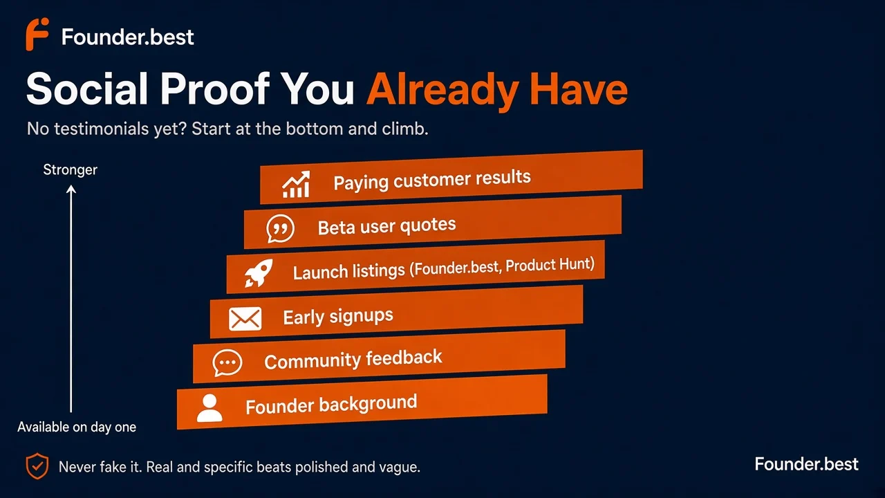 Social proof you already have - from founder background and community feedback up to beta user quotes and paying customer results
Founder background
At the pre-launch stage, you are the social proof. People buy from people, especially from small teams. A short "Who's building this" block with your photo, your name, and one or two lines of relevant background does a lot of work.
Make it specific to the problem:
"I ran a 12-person marketing agency for six years and built client reports by hand every Monday. I built this so I would never have to do it again."
That sentence is more persuasive than most testimonials, because it explains why you understand the problem. Link to your LinkedIn, X, or founder profile so visitors can check you are real.
Beta users
Even five beta users count. Ask them for a sentence or two about what the product changed for them, and ask permission to use their name, role, and photo. A quote from "Priya, founder of a 6-person design studio" is worth more than an anonymous five-star rating.
If they prefer to stay anonymous, say "Beta user, agency owner" rather than inventing a name. Honest and specific beats polished and vague.
Early signups
Numbers are proof, even small ones. "Join 340 founders on the waitlist" or "Used by 58 teams in private beta" tells visitors other people found this worth signing up for.
Only use real numbers, and update them. If the number is tiny, you can skip the count and describe who signed up instead: "Agency owners from 14 countries are already on the waitlist."
Product Hunt and Founder.best listings
A public launch gives you a legitimate, verifiable badge to put on your page. When you launch on Founder.best, you get a permanent product page with upvotes and comments, and you can add a launch badge to your site that links back to it. The same applies to Product Hunt and other launch platforms.
Visitors can click through and see real people discussing your product. That is exactly the kind of proof an early SaaS needs. A top ranking in the weekly winners is an even stronger signal, and you can say so on your page.
Community feedback
If you have been building in public, you already have proof. A thoughtful reply on Reddit, a supportive thread on Indie Hackers, or a comment on your Founder.best launch can all become social proof, with permission and a link to the original.
Screenshots of real conversations feel far more authentic than a polished quote carousel, as long as you have permission to share them.
What to do when you have no testimonials
Some founders really are at zero: no beta users yet, no launch, no quotes. That is fine. Here is what to do instead of faking it:
- Lead with the founder story. Put your background and your reason for building this where a testimonial would go.
- Show the work. Screenshots, a demo, a public changelog, or a public roadmap all prove the product is real and moving.
- Offer a guarantee. "Free during beta" or "30-day money-back, no questions" lowers the risk that testimonials would normally lower.
- Make a founding-user offer. "The first 50 users get lifetime pricing and a direct line to me." It gives people a reason to try an unproven product.
- Remove the section. An empty "What our customers say" block is worse than no block at all. Add it back when you have real quotes.
Then go get your first testimonials on purpose. Personally onboard your first 10 users, and after they have used the product for a week, ask one question: "What would you tell a friend about this?" Their answer, word for word, is often your first real testimonial.
Add pricing or explain how pricing works
Hiding pricing is one of the most common pre-launch mistakes. On an unknown product, "Contact us for pricing" usually reads as "expensive" or "not ready", and a lot of visitors simply leave.
You do not need a final pricing model. You need an honest answer to "what will this cost me?" Options, from most to least committal:
- Real plans. Two or three tiers with clear limits. Best if the product is live.
- Founding-member pricing. "Founding plan: $19/month, locked in for life. Regular price will be $39." It creates urgency without being fake.
- Free beta with a price anchor. "Free during beta. Paid plans will start at $15/month, and beta users get 50% off for a year."
- A pricing note. "We are finalizing pricing with our first users. Expect $20-50/month for small teams." It is better than silence.
Pricing also works as a validation tool. If people click "Choose plan" on a founding offer, that tells you far more about demand than a free waitlist signup. If you are still testing willingness to pay, our guide on how to validate SaaS ideas covers preorders and paid pilots in detail.
Create a strong CTA
Your call to action is where the whole page either pays off or does not. Pre-launch pages usually fail here in one of two ways: too many buttons, or a vague one.
A few rules that hold up well:
- One primary CTA. Pick one action and repeat it in the hero, after the demo, after pricing, and at the bottom. A secondary text link is fine, but five equal buttons is not.
- Match the CTA to your stage. "Start free" if the product works. "Join the waitlist" or "Get early access" if it does not. "Book a 15-minute demo" for sales-led B2B.
- Say what happens next. "Start free, no credit card" or "Get early access. We onboard 20 new users every Friday." Reducing uncertainty increases clicks.
- Ask for as little as possible. Email only, or Google sign-in. Every extra form field is a reason to leave.
- Use first-person or outcome copy. "Get my first report" often beats "Submit" or "Sign up".
Also check what happens after the click. A signup that lands on an empty dashboard or a bare "Thanks!" page wastes the most motivated moment a visitor will ever have. Send them straight to the first useful action, or tell them exactly what happens next and when.
Answer common questions with an FAQ
An FAQ is where you handle objections without cluttering the rest of the page. It is also a quiet SEO win, because FAQ answers often match the long-tail questions people type into Google and AI assistants.
Good pre-launch FAQ questions to answer:
- Who is this for, and who is it not for?
- How is this different from [the big competitor] or a spreadsheet?
- Is my data safe? Where is it stored?
- What happens to my account after the beta ends?
- Can I cancel anytime? Is there a free trial?
- Which tools does it integrate with?
- Who is behind this, and how do I contact you?
Write answers like you would reply to a customer email: short, direct, and honest. "Not yet, but it is on the roadmap for Q1" is a perfectly good answer, and it builds more trust than dodging the question.
Build trust without fake social proof
Let's be direct about this, because the temptation is real. Do not fake it. That means no stock-photo testimonials, no logos of companies that don't use your product, no invented user counts, and no "As seen in" badges for publications that never covered you.
Faking it fails in three ways:
- Visitors notice. Stock-photo faces and generic quotes like "This changed my life!" are easy to spot, and one fake element makes everything else on the page look fake too.
- It is risky. Fake reviews and misleading endorsements can break consumer protection and advertising rules in many countries.
- It hurts you later. Your earliest users are your future champions. Starting the relationship with a lie is a bad trade.
Here is what builds trust honestly when you are early:
- A real human. Founder name, photo, and a way to reach you directly
- A real product. Genuine screenshots, a demo, and a public changelog
- Clear policies. Privacy policy, terms, data handling, and a cancellation policy that fits in one sentence
- Honest framing. "We are in beta. Here is what works today and what is coming next."
- Verifiable listings. Your launch page on Founder.best, your Product Hunt page, and your profiles in relevant startup directories
- Responsiveness. A support email or chat that actually gets answered within a day
Being honest about being early is not a weakness. For early adopters, it is often the whole appeal.
How to get your first distribution before you have customers
A great landing page with no visitors is still a failed launch. Before traction, distribution matters as much as copy, and the good news is that early distribution also produces the social proof your page is missing.
Here is where your first visitors usually come from:
- Launch platforms. Submit your product to Founder.best to reach founders and early adopters, collect upvotes and feedback during launch week, and get a permanent, indexable product page with a backlink to your site. Product Hunt, BetaList, and similar platforms can add more reach.
- Startup directories. Niche and general directories send small but steady referral traffic, help search engines discover your site, and are increasingly cited by AI assistants. Our roundup of the best SaaS directories covers where to list first, and the Founder.best directory list helps you find more.
- Communities. Reddit, Indie Hackers, Hacker News, niche Slack and Discord groups, and LinkedIn. Share what you learned while building, not just a link. Communities reward stories and punish drive-by promotion.
- Founder profiles. A public founder profile links you, your product, and your story together. It makes you easy to verify, and it gives visitors one more reason to trust a product they have never heard of.
- Your own network. Personally email the people you interviewed, your beta users, and anyone who said "let me know when it is live". They are your warmest launch audience.
Every one of these channels feeds back into your page. A launch listing becomes a badge. Community comments become quotes. Signups become a number you can show. Distribution is how you get the proof you don't have yet.
For a full plan, work through the SaaS launch checklist. If your page is live and signups are still near zero, run the post-launch SEO and conversion checks.
SaaS landing page mistakes to avoid
These show up on early SaaS pages again and again. Each one is easy to fix once you spot it.
- A vague headline. If a stranger cannot say what you do after five seconds, nothing else matters.
- Writing for everyone. "For businesses of all sizes" means "for no one in particular". Name your first customer.
- Features without benefits. A long feature grid with no outcomes reads like documentation.
- No real product visuals. Illustrations and abstract mockups make visitors wonder whether the product exists.
- Fake or padded social proof. One fake logo undermines every real thing on the page.
- Hidden pricing. "Contact us" on an unknown product sends people back to Google.
- Too many CTAs. Waitlist, demo, newsletter, Discord, and free trial all on one page means none of them get clicked.
- A slow or broken mobile page. Plenty of your launch-day traffic will arrive on phones from social links. Test it on your own phone.
- No analytics. If you cannot see where visitors come from and where they drop off, you are guessing.
- Waiting for perfect. Every week spent polishing a page nobody visits is a week you did not learn anything.
A simple SaaS landing page checklist
Use this before you share your page anywhere. Here are the numbers to aim for at a glance:
A pre-launch SaaS landing page, by the numbers
- 1 line
- value proposition that says who it is for and what they get
- 3 steps
- to explain how the product works
- 3-5
- benefits, written outcome first
- 30-90 sec
- demo of the core workflow
- 1
- primary CTA, repeated through the page
- 5-7
- FAQ answers covering the top objections
Copy the full checklist into Notion, a doc, or your launch notes.
 Copyable checklist
Pre-launch SaaS landing page checklist
Clarity
☐ Headline says who it is for and what outcome they get, in plain words
☐ Subheadline explains how, in one or two sentences
☐ A stranger can explain the product after five seconds
Problem and product
☐ Problem section uses your customer's own words
☐ "How it works" in three steps
☐ Three to five benefits, written benefit first and feature second
☐ Real screenshots or a 30-90 second demo of the core workflow
Trust
☐ Founder name, photo, and relevant background
☐ Real beta quotes, signup numbers, or community feedback (with permission)
☐ Launch badge or listing link, for example Founder.best or Product Hunt
☐ No fake testimonials, logos, or numbers
☐ Privacy policy, terms, and a contact email that gets answered
Conversion
☐ Pricing, founding-member offer, or a clear pricing note
☐ One primary CTA, repeated through the page
☐ Signup asks for email only, or offers Google sign-in
☐ Post-signup screen sends users to a first useful action
☐ FAQ answers the top 5-7 objections
Technical
☐ Loads fast and looks right on mobile
☐ Title tag, meta description, and Open Graph image set
☐ Analytics tracking visits, signups, and traffic source
Distribution
☐ Launch scheduled on Founder.best and at least one other platform
☐ Listed in relevant startup directories
☐ Launch post drafted for one or two communities where your customers spend time
Before you launch, the free Founder.best tools can help with the small stuff: write a sharper tagline, check your slug, and run through the full launch checklist.
Final: launch before the page is perfect
Your first landing page will not be your best landing page. It is not supposed to be.
Your first version is a hypothesis: "This is who it is for, this is the problem, this is why you should try it." Real visitors will tell you which parts are wrong, through where they click, where they drop off, and the questions they email you. You can't get those answers by polishing in private.
If you only have a weekend, spend it where visitors actually look. Clarity and real product visuals matter far more than animations, illustrations, or a custom design system:
Where to spend a 10-hour landing page budget (suggested split)
- Headline and value proposition2.5 hrs
- Screenshots or demo video2 hrs
- Problem, how it works, and benefits copy2 hrs
- Honest proof and founder section1 hrs
- Pricing, CTA, and FAQ1.5 hrs
- Design polish1 hrs
So give yourself a deadline. Write the one-line value proposition, grab real screenshots, add the proof you honestly have, set a price, pick one CTA, and ship it this week. Then launch it on Founder.best, share it where your customers already spend time, and let the first hundred visitors show you what to fix.
Plenty of SaaS products that now have 10,000 users started with a rough page and a founder who launched anyway.
Key takeaways
- A pre-launch SaaS landing page has one job: make a stranger understand what you do, believe you can do it, and take one small next step.
- Your headline should say who the product is for and what outcome they get. Clever beats clear almost never.
- No testimonials is normal. Use proof you actually have: founder background, beta users, signup numbers, launch listings, and community feedback.
- Fake logos and invented reviews destroy trust the moment someone notices. Honesty about being early is a trust signal in itself.
- Show pricing, even if it is a founding-member price. "Contact us" on an unknown product usually means "leave the page".
- Distribution matters as much as copy. Launch platforms, startup directories, communities, and founder profiles give your page its first visitors and its first credibility.
Frequently asked questions
What should a SaaS landing page include before launch?
A pre-launch SaaS landing page should include a one-line value proposition, a short description of the problem, a three-step "how it works" section, benefit-led feature bullets, real product screenshots or a demo, honest social proof, pricing or a pricing note, one primary call to action, and an FAQ. That is enough for a visitor to understand the product and decide whether to sign up.
How do I build trust on a SaaS landing page with no customers?
Build trust with proof you actually have. Show who the founder is and why they are building this, share real beta user quotes (with permission), show waitlist or signup numbers, link to your launch on platforms like Founder.best or Product Hunt, add a clear privacy and data note, and show the real product. Specific, verifiable details build more trust than polished claims.
Should I put pricing on my SaaS landing page before launch?
Yes, in most cases. Even a founding-member price or a simple "Free during beta, paid plans from $19/month" line helps visitors qualify themselves and tells you whether people will pay. Hiding pricing on an unknown product usually lowers conversions, because visitors assume it is either expensive or not ready.
What is a good conversion rate for a SaaS landing page?
It depends heavily on traffic quality. For a pre-launch waitlist page getting targeted traffic from communities, interviews, or niche directories, double-digit visitor-to-signup rates are realistic. For cold or broad traffic, low single digits are common. Measure by channel, because a blended rate hides which sources actually work.
Can I use fake testimonials or placeholder logos on my landing page?
No. Invented testimonials and logos of companies that do not use your product are misleading, can break consumer protection rules in many countries, and destroy trust the moment a visitor notices. Use honest early proof instead, or simply leave the section out until you have real customers.
What is the best CTA for a pre-launch SaaS landing page?
The best CTA is the smallest honest next step for your stage. If the product works, use "Start free" or "Try it free". If it is still in development, use "Join the waitlist" or "Get early access". For sales-led B2B tools, "Book a 15-minute demo" works. Pick one primary CTA and repeat it, rather than offering five different buttons.
How long should a SaaS landing page be?
Long enough to answer the questions a buyer has before signing up, and no longer. For most early SaaS products that is a hero, problem, how it works, benefits, demo, proof, pricing, FAQ, and a final CTA. Simple, cheap tools can be shorter. Expensive B2B tools usually need more detail.
How does Founder.best help a SaaS with no customers yet?
Founder.best is a launch platform and directory for newly launched SaaS products, startups, and tools. You can launch your product to early adopters, collect upvotes and feedback, get a permanent indexable product page, and link your founder profile. That gives your landing page its first visitors and a launch listing you can show as honest social proof.

About the author
Anuj Shashimal
Founder, Founder.best
SaaS founder, indie hacker, and software engineer. Anuj built Founder.best to help indie founders launch, get discovered through search and AI answers, and turn launches into customers. He writes from first-hand experience growing Founder.best from zero to 400+ founders and 300+ launched products.
Tagged in
Browse all tagsKeep reading
Free tools and guides for this topic
Hand-picked from the tags on this post.
- Free tools for foundersName generator, tagline writer, slug checker, DR checker, launch checklist.
- Free startup launch checklist30+ tasks across pre-launch, launch day, and post-launch.
- Free SaaS directories for backlinksList of free SaaS and startup directories with dofollow filters, Ahrefs DR scores, and a submission checklist.
- How Founder.best worksSubmit in 10 minutes, rank on the weekly Launchpad, stay discoverable.
- Launch platform alternatives & guidesProduct Hunt alternatives, where to launch, and SEO launch guides.
Ready to launch on Founder.best?
Weekly rankings, dofollow SEO backlinks, founder stories, and a community built for indie makers.
Submit your startup